3. Making a study area map - DAE
the workshop starts here
In this workshop you learn how to create your own datasets and modify them. We assume you finished and that you have installed the PDOK plugin.
This workshop is made with Qgis version: 3.26.3-Buenos Aires
Prepare
Use the same working directory all the time as the previous workshops. We refer to this as the 📂 working directory
Open up a new Qgis project and save this in the 📂 working directory
Add the country borders. In the PDOK plug-in search for landsgrens and add the WFS to the project. (double click)
Add the province borders. In the PDOK plug-in search for provincies and add the WFS to the project. (double click)
Add the aerial images. In the PDOK plug-in search for luchtfoto Ortho 25cm RGB and add the WMTS to the project. (double click)
Now add the BRP parcels to the project which we downloaded before. You can find these quickly under Project Home in the Browser
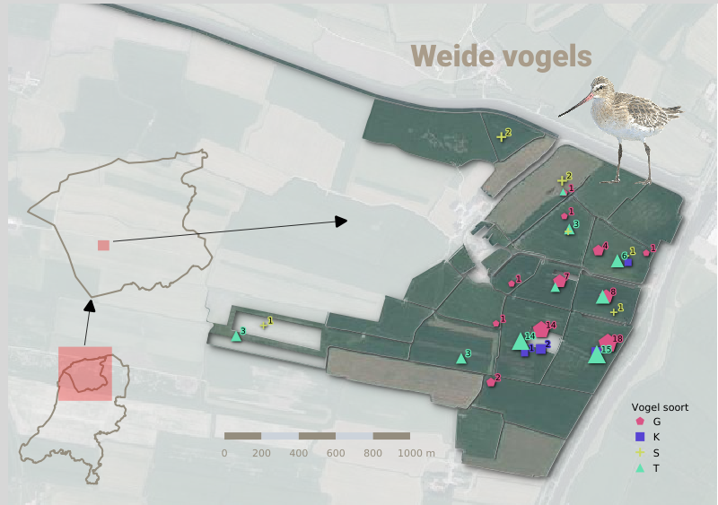
With these layers we will try to recreate something like this:
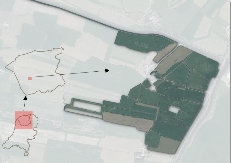
Layer Styling Panel
A brief overview of the panel:
-
Here, we select the layer we are about to style. You can change it here or bij clicking on another layer in the
Layers Panel. -
The available tabs:
- Styling options
- Label styling options
- Masks
- Symbols
- Style manager
- Style history (undo! )
-
Category of feature styling
-
Styling of the whole Layer (Different with feature styling, either separate features or the layer as a whole)
-
Live rendering on and off. If turned on the
Applybutton is not needed. Turn off when working with really large datasets! -
Undo/Redo buttons!
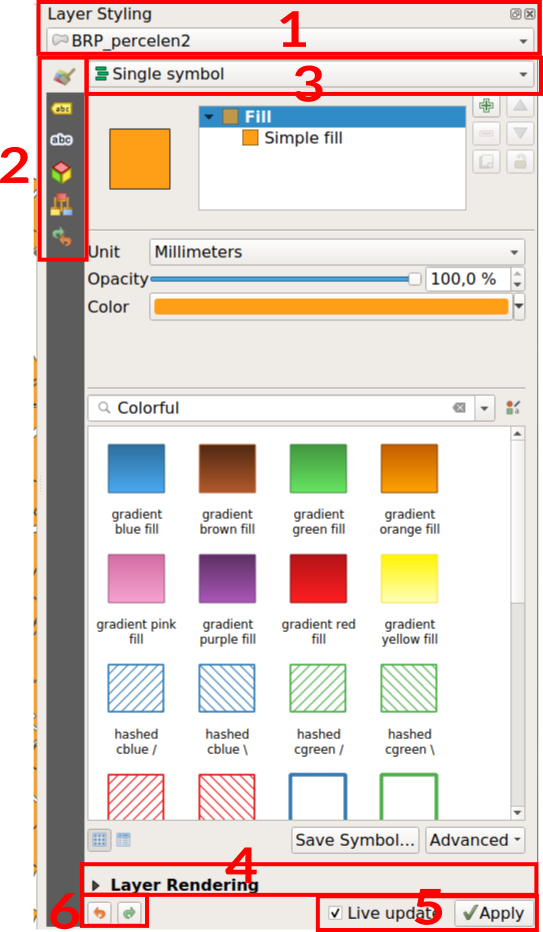
Making a study area map
We will create a study area map, showing the general location of our area.
Country borders : Outline simple line
The country borders and province borders will be styled simply with an outline.
Download the files from Canvas. Containing all the borders of our study area.
Add the country borders to your project and select it to start styling.
In the Layer styling panel, choose Single symbol. Click on Simple fill under Fill in the symbol pane.
Now some more parameters and options become available.
Change the Symbol layer type to Outline: Simple line. Like here:
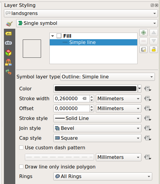
Change the Color to a nice grey color. Set Stroke width to 2 pixels.
We will add the same style to the Province data. We don’t have to do this step by step anymore but we can just copy the style from one layer to another!
Add the province borders to your project.
Right click on the country border layer > Styles > Copy Style > Symbology
Now right click on the province layer > Styles > Paste Style > Symbology
Study area - Rule Based styling.
We only want to see the province of our study area. Not all of them. so:
Select the provincie layer to start styling it.
In the Layer styling panel change the styling from Single symbol to Rule based
The style stays the same, because Rule based is initiated with the previous defined style. (this also works with Categorized for example)
Double click the only Rule to change it.
At Filter, click on the calculating tool. E This opens the Expression String Builder
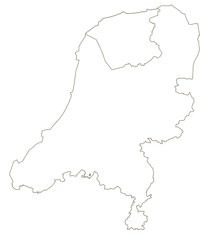
Add the filter for the naam = “Noord-Brabant”.
"naam" = 'Noord-Brabant'
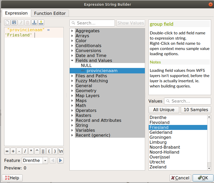
Click on OK. Did you manage?
It will look something like this.
Parcels - Inverted polygon
For now, turn the visibility off for the country borders and the province. In the Layers panel click on the eye before the layer name.
Zoom to the BRP parcels. Right click on the layer name >Zoom to Layer.
Add the aerial photo layer as well. Make sure it is visually below the parcels.
Select the BRP parcels layer to start styling.
In the Layer styling panel change the Single Symbol styling to Inverted Polygons.
Click on Simple fill under Fill and change the Fill Color to white.
change the Stroke style to No pen. So the polygon does not have a outline.
Unfold the Layer Rendering section (at the bottom) and change the Opacity of the whole layer to 70%
This is what it should look like:
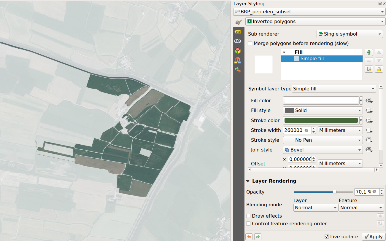
Remember you can do this with any polygon you want! So change the BRP parcels to your own relevant study area polygons and recreate this effects for your specific study area!
Draw Effects
Let explore the Draw Effects. Some effects you might know from your favorite designing software. Be aware where you put the effect on. The effects can apply on a complete layer, or per feature. This gives visually other effects!
Unfold the Layer Rendering section again.
Turn on the Draw Effects on Symbol level!!! and press the small button next to it.

We are now adding effects per feature in the layer!
Add a Inner Shadow by turning it on with the check box in front of it.
Give the Inner Shadow another color and size of 2 pixels. It will visually lift off the parcels from the background!
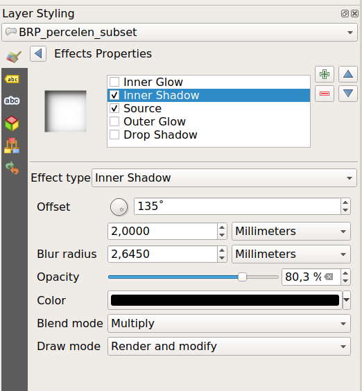
Get creative!
The Layout Manager
We prepared all our data and styling to make a nice overview of it and export it.
Go to the menu Project > New Print Layout
Give the print lay-out a name. For example: study area map.
A new window opens: the Layout Manager Here we can create a fully made up document with maps, titles, legends, scale bars, pictures and more.
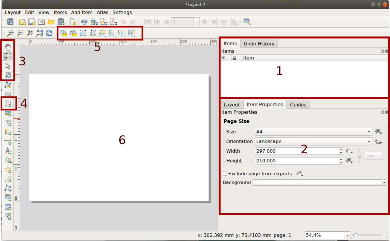
Number 1: Is the Items list. All object which we add to the page (6) can be found here. The order is also the visual order on the page. If you click one one the specific settings for that object can be changed under panel nr 2 : Item Properties. So pay attention to which object you select as active!
To the left all buttons to add object to the page can be found. Buttons at nr 3 are about navigating the view on the page.
-
The arrow button, is for moving the items around
-
The lower button is for navigating the map location within a map!! You will notice the difference.
Button nr 4 is for adding a map.
All objects to add can also be found at the menu under Add item
The buttons at 5 are for aligning and ordering the objects.
We will start with the page settings.
Page settings
Richt click on the empty page > Page Properties. The Page Properties are shown in the panel to the right (2).
Pick the A4 and landscape format.
This is the size that is used when exporting the map to a pdf or png.
Add a map
Add a map to the page by using the button  Click and drag the size on the page. (Menu
 Add item> Add Map )
Place a map to the left of the page.
The map will show the exact same layers and styling as where your QGIS project is currently set on!
So switch back to the Qgis project. Turn off all the visibility of the layers except the country borders.
Richt click on the country border layer and Zoom to Layer
Go back to the Layout Manager.
Select the map, Map 1, and click on the reload button in the panel underneath. (first button with the blue arrows), now the view of the map is synced with the Qgis project.
Then click on the second button: Set Map extent to main Main Canvas extent This changes the extent of the map to be the same as the Qgis project

In the Item properties at Layers check the checkbox Lock Layers and Lock style for Layers for the map. Now the styling and extent is locked for this map view! We can change the Qgis project again and this will stay.
Scroll down in Item properties and turn off the Background option. The background color will become transparant.
Add a second map
Create a second map to the page. 
Go back to the Qgis project, turn on the visibility of all layers, except the province.
Zoom in to the provincie so it is nicely centered.
Go back to the Layout Manager.
Select Map 2 and in the Item properties click on the reload button(the first button with the blue arrows).
Then click on the second button: Set Map extent to main Main Canvas extent This changes the extent of the map to be the same as the Qgis project

If we are not completely happy with the position of the map we can also change it manually.
Pick the Move item content button.  With this we move the content of our map.
In the Item properties at Layers check the options for Lock Layers and Lock style for Layers. Now this map cannot change anymore.
Scroll down in Item properties and turn off the Background option. The background color will become transparant.
Add a third map
Draw a new map all over the page. 
Go back to the Qgis project, turn off all visibility of al the layers except the BRP parcels subset and the aerial photo layer.
Richt click on the BRP Parcels layer name and Zoom to Layer
Go back to the Layout Manager.
Select Map 2 and in item properties click on the reload button and the View current Map Extent in Main Canvas button.

In the Item properties at Layers check the options for Lock Layers and Lock style for Layers. Now this map cannot change anymore.
Select Map 3 and choose: Bring to back so visually it becomes the background.
Add Overview
Choose Map 1 for the country boundary, in the Item Properties scroll down a bit to the Overviews section and add an overview by clicking the green plus icon.
In Map Frame, choose Map 2.
Now we have projected the location of Map 2 onto Map 1!
Do the same for Map 2, and choose the Map frame of Map 3.
Position the maps nicely, move or resize them, and add 2 arrows to indicate where everything is located. For example:

The study area of the plots is very small, so it’s not visually prominent. You could improve this by choosing a smaller reference area. In the image above, I made the pink area “appear larger” by making the outline very thick.
Edit the overview symbology visualization in the provincial map (Map 2) by giving it a thick outline in the same color.
]
Legend
Adding a Legend
Under Add items, choose Legend and click somewhere on the page (then click OK). This places an automatically generated legend on the page.
In the item properties of the legend, go to Legend items and uncheck the Auto update box.
Now we can edit and remove legend items.
Remove anything we don’t need.
Edit the texts by selecting the item and clicking the edit button (pencil icon).
Also turn off the Background of the legend.
Adding an Image, Title, and Scale Bar
See if you can enhance your study area map. Think about the storytelling tropes: setting the stage.
Find a nice image (or from your own sources). You can either paste this in or add it using the Add image button.
Add a text box for the title. Try to adjust the size, font, and color.
Try selecting the color of the titles, text, and study area boundaries using the
eyedroppertool on your bird image. Doing this helps to create a cohesive color theme.
Exporting
Once you’re satisfied, you can export the entire page to a PDF, PNG image, or SVG.
In the menu, choose Layout > Export as PDF and save the study area in your working folder. Choose your own preferred PDF settings.
Take a look at your result in the PDF!
You reached the end of this workshop!


